Saturday, July 15, 2017

Learning Composition From Early Illustrators.

Notable, professional illustrators are skilled at developing effective compositions. Many of those creating editorial and advertising illustration during the 60s and 70s were very busy. Numerous consumer magazines provided a seemingly endless volume of work. Publication trends changed and many illustrators made a trail to art galleries. 

For many of these, the transition was relatively easy. Creating an illustration composed of a couple at the beach with their new car in the background (for example) wasn’t much different than strategically placing these elements on canvas, albeit often in a different composition. 


In this illustration by Bernie Fuchs we see wonderful use of color and nicely rendered figures and foliage. What might otherwise be a huge NO-NO for artist, dividing the page with a horizon line in the center seems to work well here. 


A 50s Cosmopolitan Magazine illustration by Austin Briggs shown here uses COLOR DOMINACE to create an effective composition. Briggs was very much aware of the need to apply the Principles of Design in his illustrations. 


Bob Peak demonstrates contrast here in both space and technique. We often think of contrast in values or color and forget that contrasting textures, sizes and shapes can contribute to an interesting composition.

Not every vintage illustrator employs a ‘painterly style,’ but most are experts at creating effective, and often exciting, compositions.

Wednesday, January 4, 2017

Preliminary Sketches Can Contribute to Effective and Exciting Watercolor Paintings.

I know of artists that consider a lot of preliminary work unnecessary. Their reputation, or maybe their semi-abstract style of painting, must appear much more spontaneous than many other artists.  I think many artists are doing sketches but don't want to appear that they need to.

Certainly most watercolorists that prefer painting landscapes, seascapes and cityscapes (for example) will find preliminary sketches very useful. The need to create a pleasing composition becomes an important part of the process. Establishing depth, with a good idea how the background, middleground and foreground will be handled is essential. Placement of each element in the composition, as well as varying values and shape relationships all contribute to a more interesting and successful finished watercolor.

The preliminary B&W sketch shown here provides a fair amount of information without being terribly detailed. I know where the sunlight is coming from, the shape of the elements, architectural features and foliage placement. I complete most sketches with a marker. This prevents me from inserting too much detail.


The basic B&W sketch is evident in the preliminary color work. Ultimate placement of the elements hasn't changed. Introduction of color from my palette is shown and minor composition changes are made.
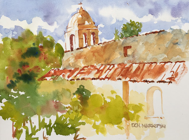


FINISHED WATERCOLOR PAINTING  -  The pleasing quality displayed in the final painting is a result of the preliminary sketches or drawings. The Spanish tile is clearly evident without painting every single tile. The foliage, although somewhat different than the color sketch, is effective. The white space on the right side, or vignette-like treatment, is intentionally balanced with large foliage mass on the left side of the painting. The textured and weathered facade of the upper wall is accomplished with several warm colors from my palette including Burnt Sienna, Cerulean Blue, Ochre and Vermillion.

Sunday, April 3, 2016

Sketchbook notations can contribute to more effective painting.

Notations in your sketchbook potentially provide important information once you've left the scene. Notes or comments pertaining to direction of light source and color, for example, become helpful. Subject details and notes referencing the overall composition made by the artist before leaving the painting location, can lead to a more effective painting.

Sunday, March 20, 2016

Animals Present Painting Challenges...keep it simple and lose the detail.

Animals present challenges we don't necessarily face with landscapes and related traditional watercolor painting. My goal with the German Shepherd watercolor painting shown here was to keep it simple and avoid introducing a lot of detail. There exists, I believe, some distinctive Shepherd characteristics that can serve as a an anchor for the painting. The unique ears, gold pupils and handsome snout are just a few. Capturing an animal's most recognizable features will often contribute greatly to the successful watercolor painting and potential sale.

Sunday, August 9, 2015

CATALYST In Westminster

Catalyst is an art space. A gallery. A Studio. A classroom. An experience. It was developed as a place for creativity, creation and fun. I believe there primary focus is class instruction. They have a lot of art instruction classes which include Life Drawing. The 3-hour sessions include live models and are only $15 per session. Their sessions are offered Wednesday afternoon and evening and Sunday afternoons from 4-7 pm. Pretty hard to beat. They’re located at 6630 Westminster Blvd., Westminster, CA 92683 and their phone number is 714.891.3626. A very informative website is provided at http://www.artsupplywarehouse.com/catalyst.php. The Catalyst is part of the Art Supply Warehouse, my favorite art store in Southern California.

Negative Painting


The floral watercolor composition shown here typifies an example of NEGATIVE PAINTING. It's a watercolor I completed several years ago. It's one of few examples I have that display multiple layers. As many of you know, I'm basically a direct painter. A very light yellow (Cadmium Yellow Light) and very light green layer (Sap Green) were applied first. These are evident in part of the background.


The second layer consisted of a darker green (Sap Green with less water) and some red. The application of this layer is carefully applied. It distinctly defines the irregular shape of both the flower and leaf edges.


The third layer fills in the remainder of selected leaves and flowers. Finally the shadow areas are applied. The very last strokes define the fine line of the flower's filament. 


A Rigger Brush works well for this very fine line. The character of this unique brush actually prevents us from creating a line that is too thick.